

Purpose
Compare actual service with its target, examine delivery and inventory trends, and identify product categories that need a closer look.
Before you start
You need access to Analytics, and Performance must be available for the selected webshop. Check the date range, chart grouping, metric and unit before interpreting a result or comparing it with another report or export.
Steps: open Performance
- Select the webshop you want to review.
- Open Analytics from the main navigation.
- Select Performance from the report menu.
- Wait for the report to finish loading.
Fields: read the headline cards
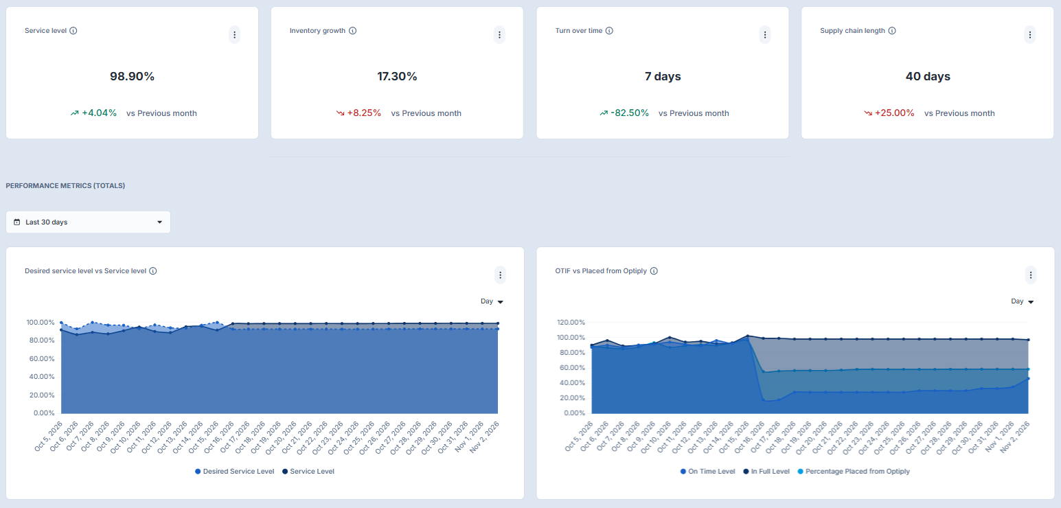
The example shows four cards:
- Service level: a headline service-level result. Compare actual service with its target in the chart below.
- Inventory growth: a headline view of inventory growth.
- Turn over time: a duration displayed in days. See Turnover time for concept guidance.
- Supply chain length: a supply-chain duration displayed in days.
Read the comparison label beneath each value. In this example it says vs Previous month. Check this separately from the date range selected for the charts; do not assume that changing chart dates also changes the cards' comparison period. A comparison colour or arrow alone does not explain why a result changed.
Review performance over time
- Find Performance Metrics (Totals) and choose the period to review.
- Check the grouping control on each chart, such as Day. Grouping is the time interval used to display results; it does not change what the selected metric means.
- Read the chart title, legend and unit before comparing its series.
- Use the questions below to decide where to look more closely.
Are we meeting our service target? Compare Desired Service Level with Service Level. The desired level is the configured target; service level is the measured average percentage for the selected period. See Service levels and simulations.
How are deliveries and ordering performing? The OTIF vs Placed from Optiply chart shows separate On Time Level, In Full Level and Percentage Placed from Optiply series. OTIF means On Time In Full; do not read these separate series as one combined OTIF score. Placed from Optiply is an order-count percentage; use the Percentage Placed from Advice definition, not a unit- or value-weighted interpretation. It is not proof that every order was unchanged or fully automated.
How is inventory changing? In the inventory chart, compare Inventory Value, Inventory Value on Order, Inventory Position, Deadstock Value and Overstock Value. Inventory Position is inventory value plus inventory value on order. The deadstock and overstock measures are average currency values for the selected period. See Dead stock for more context.
How do turnover time and supply-chain length compare? Review the two series together, using their day-based units and the same period. These measures are average durations, not currency values.
Compare product categories
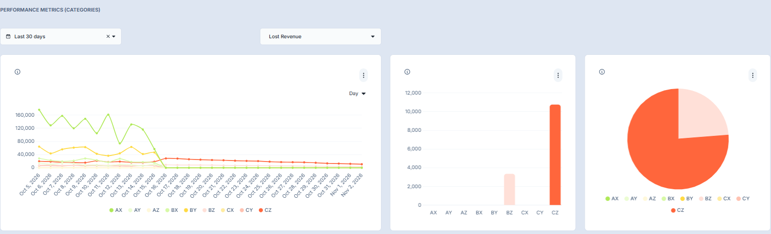
Use Performance Metrics (Categories) to examine the selected metric across ABC/XYZ product profiles, such as AX through CZ. See ABC categories and ABC/XYZ classification settings for the category concepts.
- Choose the period in the Categories section.
- Select the metric you want to examine. The example below uses Lost Revenue.
- Read the trend chart to see how the metric varies over time; check its grouping and legend.
- Compare the category bars, then use the pie chart to review the displayed shares.
- Check the selected metric, unit and period before comparing categories or sharing the result.
Lost Revenue is an estimate, not a recorded sales transaction. A large share, a zero or a sudden change does not by itself explain the cause. Use the chart as a starting point for a closer review, not as proof of a specific problem.
Expected result
You can identify the active period and metric, compare the relevant chart series, and find categories that need further investigation. Changing a chart's controls updates the associated view; do not assume every card or section uses the same settings.
Limitations: data refresh and interpretation
Analytics refreshes daily, so recent operational changes may not appear immediately. Most Performance measures are averages across the selected period; daily revenue measures are summed. A chart's grouping does not make different calculations interchangeable, and a report value may differ from a current operational value.
Viewing and filtering Performance does not edit service-level settings or purchase orders. Use the appropriate operational page when you need to make a change.
Troubleshooting
- Performance is missing: confirm the selected webshop, then ask your administrator or Optiply support to check access and report availability.
- The report does not finish loading: reload Performance once and wait for it to finish loading.
- A chart has no data: check the relevant section's date range and selected metric. Try a wider period.
- A value is unexpected: check the metric, unit, period, grouping, legend and any displayed comparison label. Allow for the daily refresh before comparing with operational data. Do not infer a cause from the example images.
If the issue remains, contact Optiply support with the webshop, report, affected card or chart, active settings and what you expected to see. Do not send credentials or secret access links.